Learning Responsive Web Design

Master responsive web design with custom CSS and HTML to create websites that adapt to all screen sizes and devices. Enroll now and enhance your skills!

  • Overview
  • Curriculum
  • Instructor
  • Review

Brief Summary

This course, led by Geoff Blake, teaches you how to make websites that look great on any device—be it mobile, tablet, or desktop. You'll learn essential CSS and HTML techniques to create responsive designs that adapt seamlessly to different screen sizes.

Key Points

  • Create custom CSS and HTML for responsive design.
  • Understand breakpoints for different screen sizes.
  • Use CSS3 and HTML5 techniques for adaptability.
  • Set up external style sheets for multiple resolutions.
  • Deal with navigation, graphics, and text in responsive layouts.

Learning Outcomes

  • Ability to create adaptive website designs.
  • Understanding of external CSS files tailored to device resolutions.
  • Confidence in using modern web design techniques.

About This Course

Learn How To Create Web Sites That Render Correctly On Different Screen Sizes And Operating Systems

In this Responsive Web Design training course, expert author Geoff Blake shows you how to create custom CSS and HTML so that your web site responds to differing screen sizes. With mobile and tablet web traffic increasing by leaps and bounds every day, all web designers should know how to create breakpoints and custom CSS layouts to adapt their designs to varying device resolutions.

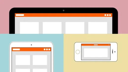
You will learn how to setup your external style sheets for three different resolutions, and how to customize your layouts for each of those. This training video will teach you how to deal with navigation and graphics as well as text and other layout features, making them responsive. You will use the latest in CSS3 and HTML5 techniques to create a website design that will gracefully wrap and adapt to three different screen sizes. Extensive working files are included with this video tutorial, so you can work along with the author throughout each lesson.

When you have completed this computer based video training course, you will be capable of creating responsive, adaptive designs for your websites. You will understand how to create different external CSS files that are called depending on the resolution of the device that is requesting the web page. You will be confident in your ability to create a Responsive Web Site for todays mobile world!

  • Learn How To Create Web Pages That Render Correctly On Any Platform Or Device

Course Curriculum

1 Lectures

Instructor

Profile photo of Infinite Skills
Infinite Skills

Infinite Skills is a Canadian based company who offer a huge and ever growing range of high quality eLearning solutions that teach using studio quality narrated videos backed-up with practical hands-on examples and comprehensive working files. All courses are created by trained educators and experts in video based education.The emphasis is on teaching real life skills that are essential for...

Review
4.9 course rating
4K ratings
ui-avatar of Osvaldo  Dias dos Santos
Osvaldo D. D. S.
5.0
5 years ago

A well-taught step-by-step guide.
It would be good if the slideshow had been implemented with JavaScript, instead of an already available third-party app.
Appreciated.

  • Helpful
  • Not helpful
ui-avatar of Jean-Philippe Moyse
Jean-philippe M.
5.0
5 years ago

each section is well thought. Great class to learn or refresh your Responsive Web design!

  • Helpful
  • Not helpful
ui-avatar of Ilia Vorontcov
Ilia V.
4.5
7 years ago

Too many details for me. Also absolutely useless part regarding Dreamweaver. But I was totally happy to learn about responsive design!

  • Helpful
  • Not helpful
ui-avatar of Velavan Palanisamy
Velavan P.
4.0
7 years ago

This is course is useful and effective. "Debugging with Chrome Developer Tools like Inspecting Elements" is missing. For lower resolution, menu should be displayed vertically, only if menu button is clicked - this is missing. CSS: Color specification is not explained clearly; only RGB type is used like hard-coded, but not hexadecimal colors, for which BRACKETS has color editor / picker. BRACKETS editor has Live Preview, which is more effective. Thanks for creating this course.

  • Helpful
  • Not helpful
ui-avatar of Gabrielle Botbol
Gabrielle B.
5.0
7 years ago

Very good course with useful tools

  • Helpful
  • Not helpful
ui-avatar of Tim Wawman
Tim W.
4.0
7 years ago

Good course - easy to follow with an example of a typical real world application.

  • Helpful
  • Not helpful
ui-avatar of Man-Kin Chan
Man-kin C.
5.0
7 years ago

Excellent introductory class. Easy to follow along and instructor was clear, took his time and did his best to explain why we were doing certain things a certain way, plus everything worked.

  • Helpful
  • Not helpful
ui-avatar of Richard Scarff
Richard S.
5.0
8 years ago

Very useful, explained at a good pace, lots of tips and tricks.

  • Helpful
  • Not helpful
ui-avatar of Bharath AK
Bharath A.
5.0
8 years ago

really a good course in responsive design

  • Helpful
  • Not helpful
ui-avatar of Sebastian Rothe
Sebastian R.
5.0
8 years ago

Toller Kursleiter. Alle Schritt sind einfach nachvollziehbar und ausreichend erklärt. Der Kursleiter schweift nicht ab und verliert sich nicht in Details. Klare Empfehlung!

  • Helpful
  • Not helpful
Leave A Reply

Your email address will not be published. Required fields are marked *

Ratings

Courses You May Like

Lorem ipsum dolor sit amet elit
Show More Courses