Interactive Python Dashboards with Plotly and Dash

  • Overview
  • Curriculum
  • Instructor
  • Review

About This Course

Learn how to create interactive plots and intelligent dashboards with Plotly, Python, and the Dash library!

Welcome to Python Visualization Dashboards with Plotly's Dash Library!

This course will teach your everything you need to know to use Python to create interactive dashboard's with Plotly's new Dash library! Have you ever wanted to take your Python skills to the next level in data visualization? With this course you will be able to create fully customization, interactive dashboards with the open source libraries of Plotly and Dash.

Dash instructional courses from Plotly usually cost more than $1000, but now you can get the bootcamp experience for a fraction of that price in this self-paced course that includes example code, explanatory videos, student support in our chat channels, Question and Answer Forums, and interactive exercises.

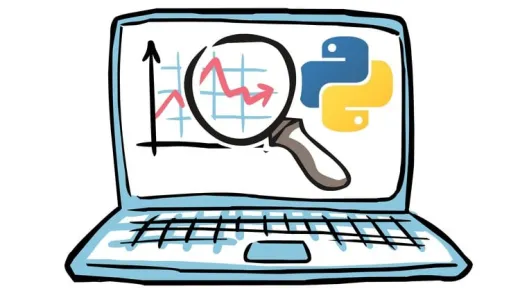
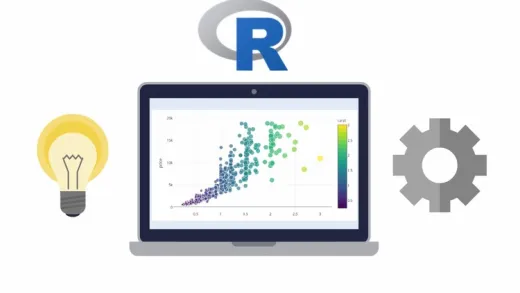
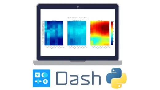
We'll start off by teaching you enough Numpy and Pandas that you feel comfortable working and generating data in our quick crash course. Then we'll continue by teaching you about basic data visualization with Plotly, including scatter plots, line charts, bar charts, bubble charts, box plots, histograms, distribution plots, heat maps, and more! We'll also give you an intuition of when to use each plot type.

After this and at the end of each section you'll be given exercise tasks to test and evaluate your new skills, a feature no other Plotly Dash training offers!

Once you have a grasp on Plotly basics we'll move on to the bulk of the course which is utilizing the Dash library to leverage the power of plotly plots to create interactive dashboards. We'll discuss how to create layouts for dashboards, how to have interactive callbacks, dealing with multiple inputs and outputs, creating interactive components, and more!

We'll finish off the course by going over live updating dashboards that automatically update in real time and even show you how you can deploy your dashboards live to the web with the Heroku service.

By taking this course you will be learning the bleeding edge of data visualization technology with Python and gain a valuable new skill to show your colleagues or potential employers. After completing the course you will have a certification you can post to your LinkedIn profile and a portfolio of dashboard projects you can share as well.

All of this comes with a 30 day money back guarantee, so what are you waiting for? Enroll today and we'll see you inside the course!

  • Learn about Plotly to create plots like Bar Charts, Line Charts, Scatter Plots, Heat Maps, and more!

  • Create Layouts with Plotly's Dash library.

  • Use Dash to create interactive components with Plotly.

Course Curriculum

1 Lectures

1 Lectures

Instructors

Profile photo of Jose Portilla
Jose Portilla

Jose Marcial Portilla has a BS and MS in Mechanical Engineering from Santa Clara University and years of experience as a professional instructor and trainer for Data Science, Machine Learning and Python Programming. He has publications and patents in various fields such as microfluidics, materials science, and data science. Over the course of his career he has developed a skill...

Instructors

Profile photo of Pierian Training
Pierian Training

Pierian Training stands as a premier provider in the realms of Data Science and Machine Learning education, offering both in-person and virtual instructor-led training tailored for enterprises. Explore our comprehensive profile to discover a wide range of courses designed to enhance your professional skills and organizational capabilities. Feel free to contact us if you have any questions in the link...

Review
4.9 course rating
4K ratings
ui-avatar of Amlan Roy
Amlan R.
5.0
7 months ago

excellent so far

  • Helpful
  • Not helpful
ui-avatar of John Brown
John B.
5.0
7 months ago

The content is excellent, while the explanations are crystal clear. Excellent

  • Helpful
  • Not helpful
ui-avatar of SAĞNAK SAĞKAL
SaĞnak S.
5.0
8 months ago

Explanations are clear and examples are strong.

  • Helpful
  • Not helpful
ui-avatar of Robert Willner
Robert W.
4.0
8 months ago

Both course material and the lectures were very good. Good level of detail and useful examples were presented. The course material is somewhat out of date and needs to be updated. Also, one of the last examples relies on an on-line service that now requires a paid subscription. Would definitely recommend this course to others.

  • Helpful
  • Not helpful
ui-avatar of Warren Navarro
Warren N.
5.0
9 months ago

Very well done, paced, explained, and shown to do by doing. Well done!

  • Helpful
  • Not helpful
ui-avatar of CARLES BOLO MARTINEZ
Carles B. M.
3.0
9 months ago

Could dive deeply on more types of graphs. Use cases are scarce as well and in the final project should be renovated since the access to certain webs have changed and the examples cannot be applied

  • Helpful
  • Not helpful
ui-avatar of Lee Wilson
Lee W.
5.0
9 months ago

Fantastic Tutor with a strong ability to simplify methods for beginners

  • Helpful
  • Not helpful
ui-avatar of Wellington Izidoro do Nascimento
Wellington I. D. N.
5.0
9 months ago

Curto muito bom! Além de familiarizar bem com os componentes e estruturas do Plotly e Dash ainda dá uma visão geral sobre o processo de criação de painéis em diferentes frameworks. O tradutor automático funcionou perfeitamente.

  • Helpful
  • Not helpful
ui-avatar of Shilpa Maity
Shilpa M.
5.0
9 months ago

good

  • Helpful
  • Not helpful
ui-avatar of Rajesh Swarnkar
Rajesh S.
3.5
10 months ago

Good, but its not updated for the Plotly express. Author should cover few aspect of plotly express.

  • Helpful
  • Not helpful
Leave A Reply

Your email address will not be published. Required fields are marked *

Ratings

Courses You May Like

Lorem ipsum dolor sit amet elit
Show More Courses