Brief Summary
Ready to take your Excel skills to the next level? This course is all about making your data pop with cool visualizations using ExTool! It’s super easy and fun!
Key Points
-
Master advanced Excel visualization techniques
-
Create stunning animated graphics
-
Enhance business intelligence skills
Learning Outcomes
-
Create various types of data visualizations in Excel
-
Understand and apply advanced Excel functions for analysis
-
Boost work efficiency with visually appealing charts
About This Course
Now that you've conquered basic Excel functions, it's time to transform your data into beautiful visualizations!
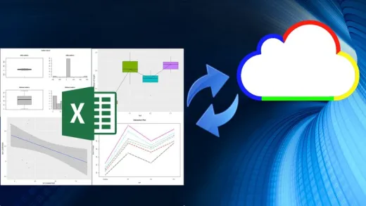
This course will teach students how to master their Excel skills by learning both basic and extended data visualization and business intelligence related functions using the ExTool Application. In the first section of the course, students will learn how to create the following data visualizations: 3D Surface Plot, Force Arrow Chart, Plot Pins on a Google Map, Plot Data on a Google Map, and Biomedical Batch Analysis Chart, Loss Analysis Chart, Scatter Plot, Multiple Stock Analysis Chart, Risk Analysis Map. The second section of the course will demonstrate the following functions: Air Quality Heat Map, Candlestick Chart, Stacked Area Line Chart, Colored China Air Quality Chart, Multiple Funnel Chart, Basic Radar Chart, Bar Negative Chart, Sized Pie Chart, Migration Map, Sankey Diagram, Stepped Waterfall Chart, and Funnel Align Chart. Through the mastery of these functions, users will be able to transform their data into beautiful, animated graphics that are easy to work with and understand.
At the end of this course, students will be able to master their Excel skills by learning both basic and extended data visualization and business intelligence related functions using the ExTool Application. Through this mastery, work efficiency will increase and result in a more productive, positive work or educational environment.


Manohar K.
VERY GREAT